Webflow vs Figma: Two Powerful Tools Compared
Editorial Note: We earn a commission from partner links. Commissions do not affect our editors' opinions or evaluations.
Updated June 15, 2024
Published June 21, 2023
Webflow and Figma are both powerful tools that turn ideas into modern web designs. Both offer innovative design and prototyping capabilities, but they have distinct features.
Wonder how to choose Webflow vs. Figma? You’ve come to the right place. This guide compares Webflow and Figma on various criteria, providing information to help you decide which is best for your projects.
Let’s get started!
What Is Webflow?
In the simplest of terms, Webflow is a no-code platform that allows anyone to design and build websites without having to write a word of code. Webflow’s simple drag-and-drop interface lets you design and build intuitive websites with a nice visual editor. In the background, Webflow generates clean, semantic HTML, CSS and JavaScript code that can be modified and exported if you wish to do so.
Related
Webflow comes with great features like editable, easy-to-use templates, web hosting services, plugin support, editable code, multi-access collaboration features, and shareable prototypes. Websites built with Webflow are scalable and integrable with several third-party integrations.
You aren’t restricted to any theme and you can design your websites with as many variations as possible without necessarily adding an external plugin. Webflow can be used to build any kind of website, from ecommerce sites to corporate websites.
What Is Figma?
Figma is a browser-based UI/UX design app that can create conceptual web designs, mockups, and prototypes. Figma vector graphics editor lets users create mockups and prototypes of login pages, web pages, buttons, icons, and other UI tools before the live versions are coded, developed, and released.
Related
The prototypes and designs are in the form of interactive URL links that can be easily shared with developers, clients, project managers, and other stakeholders. Designs made on Figma are made easy to implement by developers with enough room for real-time collaboration, commenting and revisions.
If you have a website, app, or software in mind and need a good platform for creating a concept design, Figma is just what you need. The user interface, element-editing tools, and prototyping features provide exactly what you need to bring your designs to life. Figma is so good that last year, Adobe, the owner of its closest competitor, “Adobe XD” announced plans to acquire Figma for $20 billion.
User Interface Comparison
Webflow: Multi-layered Interactive Menus
The Webflow Designer is easy to use, with a nice layout that has sections, grids, and containers. It has the website canvas at the center and panels and sidebars at each corner of the screen.
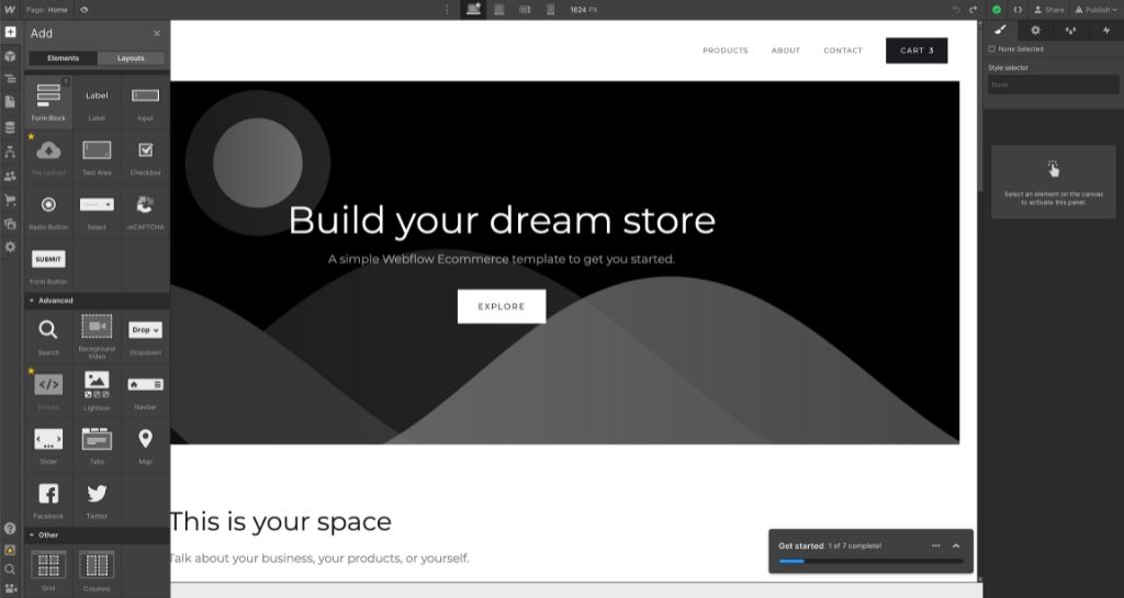
You can easily drag items from the menus to the design canvas. Webflow utilizes multi-layered interactive menus (mega menus), allowing for easier access to buttons and tabs as opposed to the flat 2-level navigation system of other website builders. Picking out borders, colors, backgrounds, and fonts is straightforward.
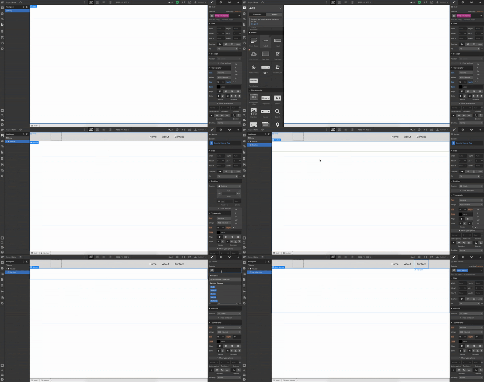
Overall, the interface is uncomplicated and accessible for beginners.
Figma: Clutter-free User Interface
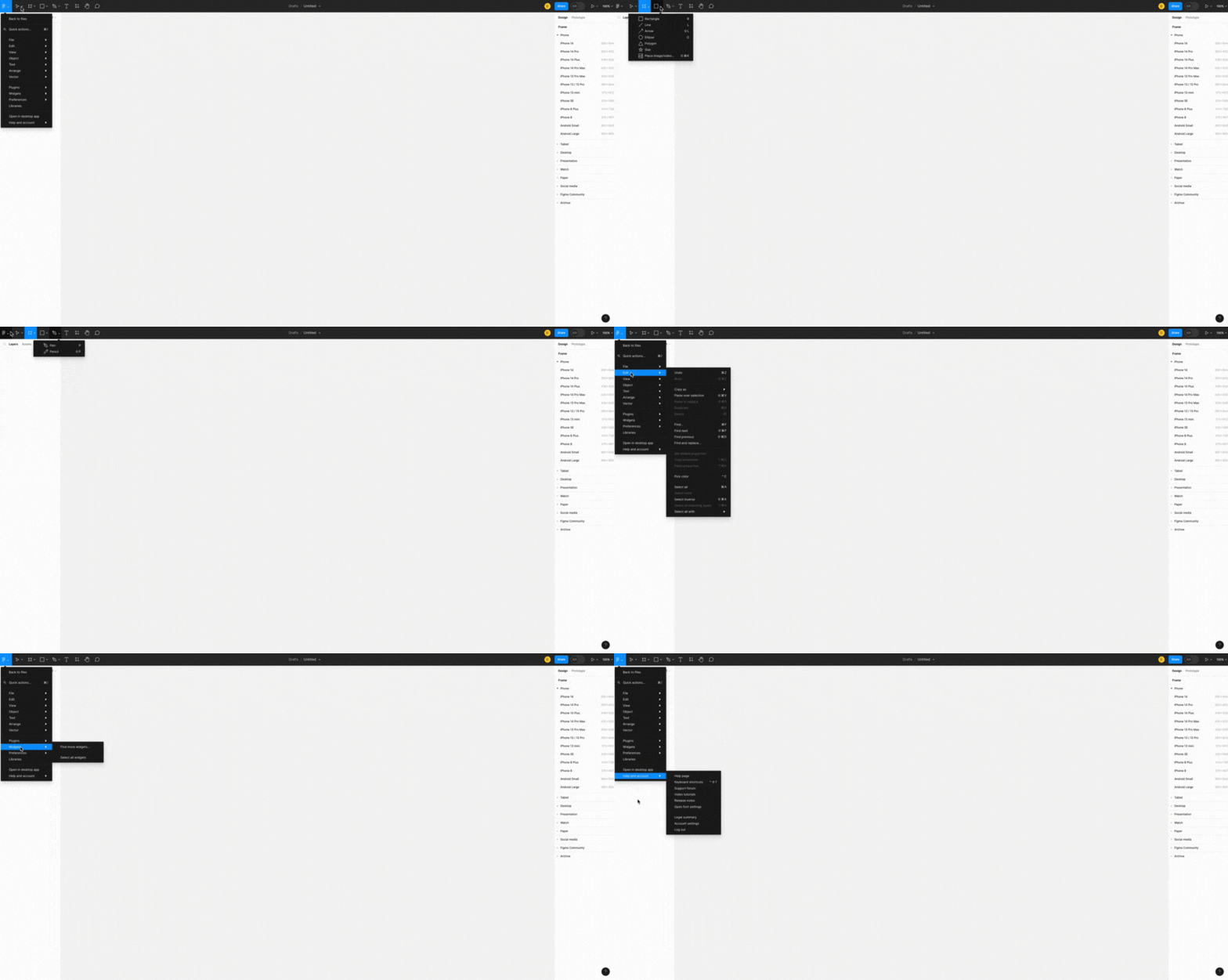
Figma has a refreshingly clean and intuitive user interface that makes it easy for designers to access the design tools. The browser-based app is incredibly responsive and easily navigable with icons, buttons, design assets and templates readily accessible. The major tools are at the top of the screen with the left side of the page showing layered design pages.
Summary of Webflow vs. Figma on User Interface
Both design tools offer nice user interfaces that serve as a testament to the competent design options they offer users.
Webflow features prominent interactive menus for easy access to web design and development tools. On the other hand, Figma delivers a clean user-interface experience that is highly responsive with no lags, regardless of the complexity of your design. There is hardly anything to complain about regarding the user interface of these two apps.
Design Capabilities Comparison
Webflow: Responsive Web Design
Webflow is a tool for building attractive, functional websites. It uses a responsive design approach, meaning the websites it creates look good on any screen size. You can add and customize design elements, including animations and layouts. Webflow also offers color blend and backdrop filters for better color grading.
Webflow’s interactions feature lets you add complex animations without needing to know JavaScript. You can make your own animations or use one from Webflow’s library. It also supports conditional logic, allowing you to automate actions on your website. For accessibility, Webflow includes color contrast analyzers and vision preview modes.
Figma: Modern Vector-based Graphics Design
Figma is a design tool packed with features that simplify and enhance the design process. It offers auto layout and auto-resizing, along with plugins and widgets for task automation. You can easily switch designs and link to your design files with its flexible styles and accessible library assets.
Figma is known for its fast design iteration times, thanks to intuitive tools and innovative components. It also allows users to add interactive components and conditional logic to their designs. This makes Figma a great choice for creating UI and UX designs for websites, desktop, or mobile apps.
Summary of Webflow vs Figma on Design Capabilities
Webflow and Figma are both powerful design tools. They support nested components, structural elements, and resource libraries.
Webflow is versatile, suitable for many types of website design. It offers templates and plugins to enhance the design process, with a focus on accessibility.
Figma is ideal for conceptual and interactive UI and UX designs. It offers more control over the design process, making it a good choice for projects that require multiple design iterations. If you have a simple website project with minimal design changes, Webflow may be a better fit.
Collaboration Features Comparison
Webflow: Multi-access Collaboration
Online collaboration is a major consideration for teams. The Webflow Designer allows multiple users to collaborate on web designs and layouts with team leads and admins able to assign design access, roles and permissions to each team member.
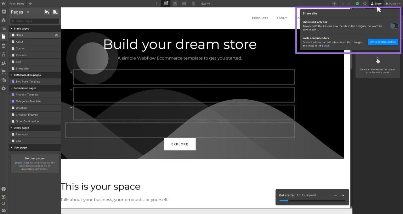
Multiple people can work on a web design simultaneously and everyone can view changes in real-time. So, some team members could be working on design changes, dynamic content and custom code, while other team members can simultaneously work on images, text, SEO metadata, and CMS content.
Figma: Real-time Collaboration with Feedback Options
Figma’s collaboration features are one-of-a-kind with full-fledged real-time collaboration between team members. It offers collaborative tools like Observation mode, version history, varied access control, shareable links and prototype.
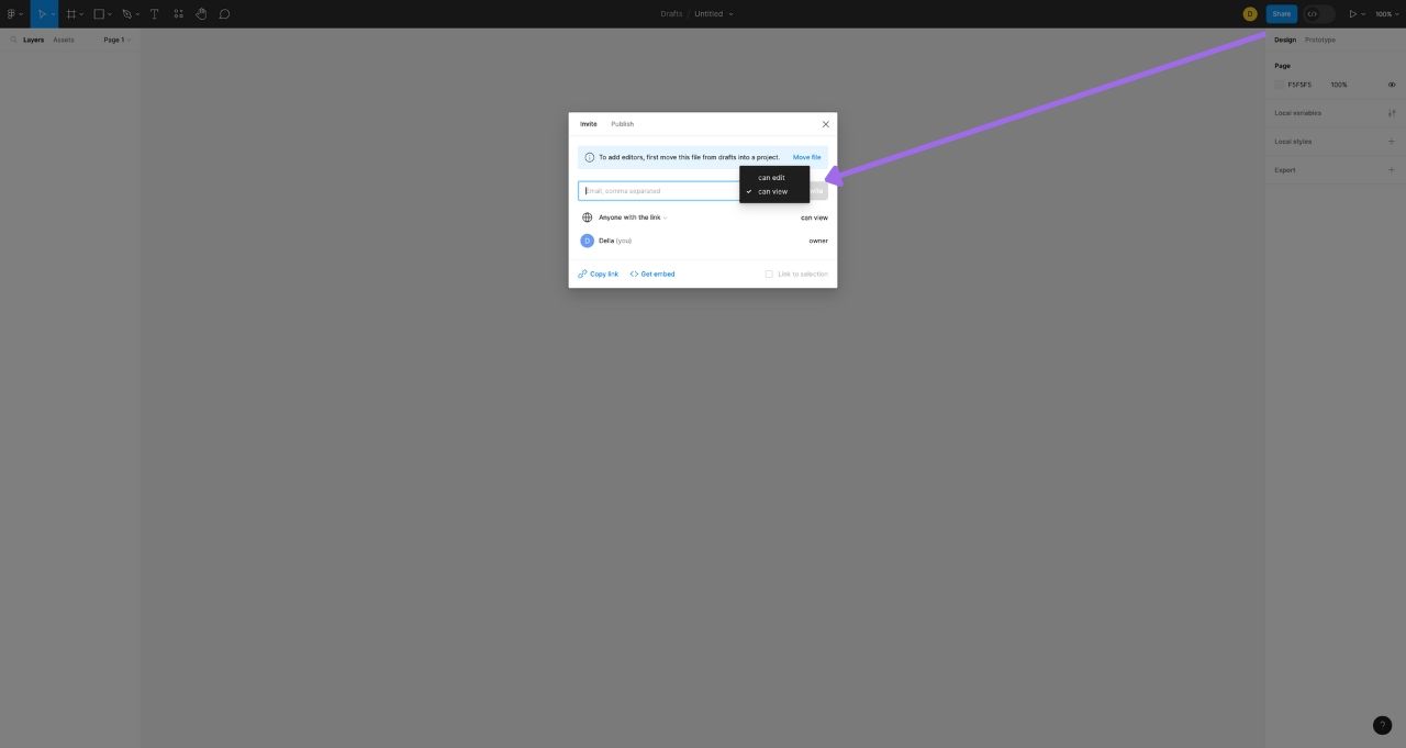
The embedded comment and chat system allows everyone from clients and designers to make design comments right on the design page. This allows for clear annotations and back-and-forth messages on the project page. Project comments can be published to Slack and other communication tools.
Figma’s FigJam tool aids brainstorming at the start of the design process. It acts as a notebook for gathering ideas before the project begins. Figma eliminates the need to share multiple design files. Everything is accessible in one place, with auto-save ensuring no loss of work.
Summary of Webflow vs Figma on Collaboration
Both Webflow and Figma offer robust collaboration features. Webflow is ideal for web design teams needing varied access levels. Figma is best for teams with multiple UI/UX designers needing equal access. It’s also suitable for clients needing real-time access to project files. Despite both being effective, Figma is the winner for collaboration features.
Prototyping Comparison
Webflow: Interactive, Live Prototypes
Webflow Prototyping Webflow offers remarkable live prototyping that sets the stage for your final website design. Unlike several other design tools, Webflow’s mockups and prototypes are responsive and interactive, which is a far cry from static prototypes.

Buttons are fully clickable and active, with web features activated before the final web design. Copywriters can edit content in prototypes and most importantly, the prototypes can be converted to HTML, CSS and JavaScript code that developers can work on if need be. This makes collaboration easier between designers and developers.
And if you feel your prototypes are perfect? You can publish it straight and have your website ready in a jiffy. There is almost no need to spend money or time hiring web developers.
Figma: Shareable, Animated Prototypes
Figma’s prototyping feature lets users create interactive animated prototypes from static designs. Bring your prototype to life and connect UI elements with specific interactions by adding dynamic transitions, dynamic overlays and advanced GIFs.
Prototypes can be integrated with Notion, Dropbox and other third-party prototyping tools. Prototypes are easily shared with stakeholders with room for feedback right on the prototypes.
Summary of Webflow vs Figma on Prototyping
Webflow offers a seamless transition from prototypes to published websites. But Webflow prototypes are restricted to the Webflow platform. Figma allows for more tweaking of design prototypes that can be implemented and developed for almost any platform.
If you are big on speed, then Webflow might be your choice due to the quick transition from prototyping to production. But if you are big on flexibility, collaboration and manipulation of prototypes, then you might prefer Figma.
Integration Comparison
Webflow: User-friendly Integration with Popular Tools
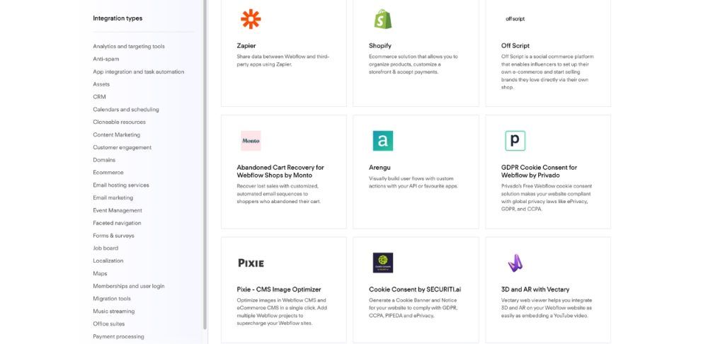
Webflow comes with a superb stack of integrations and apps for content management, ecommerce, analytics and workflows. These integrations include Zapier, Airtable, Google Analytics, Zoho, Calendly, AWeber, HubSpot for CRM, Shopify for ecommerce, DigitalOcean for cloud hosting, Cloudflare for security, Mailchimp for email marketing, and lastly, Stripe and PayPal for payment. Plus, of course, the Figma plugin that allows users to convert Figma designs to responsive Webflow sites.
Figma: Customizable User-created Integrations
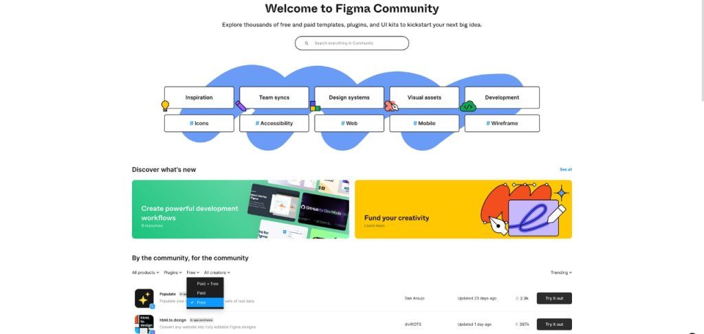
Figma offers spontaneous integration with Dropbox, Notion, Google Sheets and several other tools. The app also has tons of free community-made plugins that you can use to automate tasks and replicate workflows. Figma’s plugins can be used to generate color shades, fonts, and create unique style guides. You can also make custom private plugins, widgets and component libraries for your organization to hasten and enhance your design process.
Summary of Webflow vs Figma on Integration
Both platforms support integration with multiple tools and services. Webflow’s plugins are more user-friendly and streamlined towards web development, with support for popular services. Figma plugins are targeted at UI designers with an affinity for creating customized plugins for specific projects.
Overall, advanced users might prefer Figma integrations while less-technical users would prefer Webflow’s seamless integrations.
Pricing Comparison
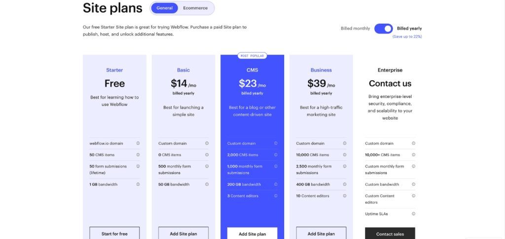
Webflow: Tiered Pricing with Increasing Capabilities
Webflow offers a free plan with basic web design features. The Basic plan, at $14 per month, includes custom domains, custom code, 50 GB bandwidth, and more. The CMS plan, at $23 per month, adds site search, API access, and increased bandwidth. The Business plan, at $39 per month, provides access to 10 content editors, form file uploads, and more. The Enterprise plan offers unlimited access to all features at a negotiated price.
A more detailed Webflow pricing review can be found in our dedicated Webflow review.
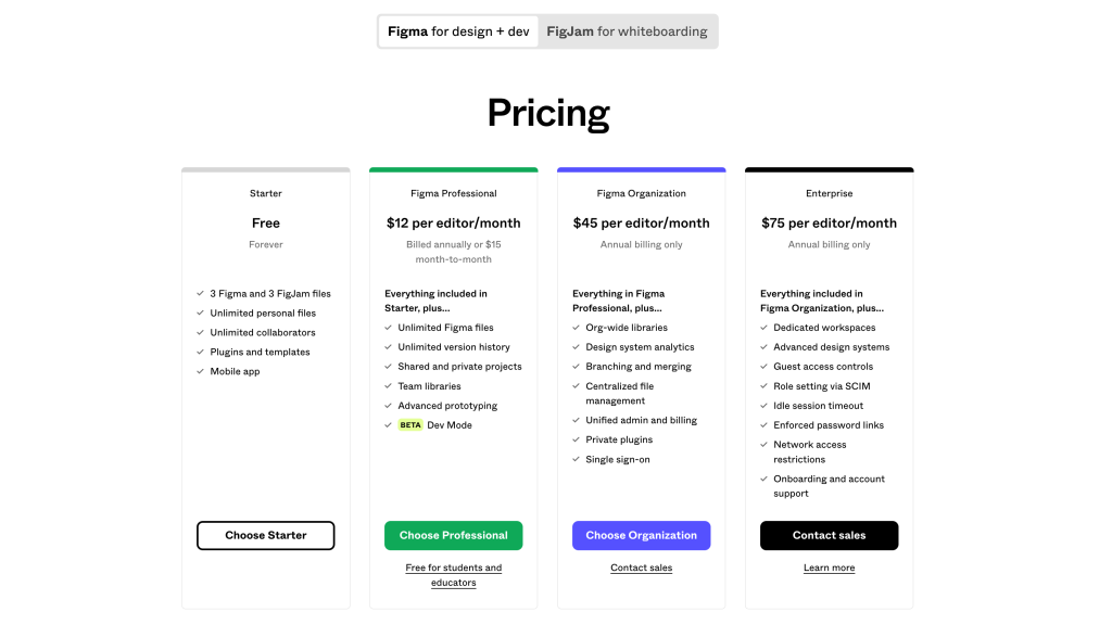
Figma: Superb Free Plan with Advanced Collaboration Tools on Paid Plans
Figma’s free plan is feature-rich, suitable for various design projects. It includes access to the Figma editor, advanced drawing tools, animations, unlimited file storage, and more.
For professionals and larger organizations, Figma’s higher-tiered plans offer additional features like audio conversations, private projects, custom workspaces, design analytics, and advanced security features.
Summary of Webflow vs Figma on Pricing
Both Webflow and Figma offer free plans, with tiered plans providing more options and features. Figma’s free plan is particularly robust, making it a preferred choice for new users and small-scale projects.
For paid plans, Figma focuses on advanced design features, while Webflow offers additional web development tools. Design-focused users might prefer Figma, while those needing web hosting and development features may lean towards Webflow.
Summary of Webflow’s Pros and Cons
Pros
- Superb no-code web development platform
- Perfect for CMS and ecommerce sites
- User-friendly interface
- Good library of beautiful templates
- Competent third-party integrations
Cons
- No mobile app
- Limited code modification
Summary of Figma’s Pros and Cons
Pros
- Great UI/UX design tool
- Seamless real-time collaboration systems
- Awesome free plan
- Customizable private plugins
- Mobile app availability
Cons
- Prototyping tool could be better
- Barely offers web development functions
Conclusion
Webflow and Figma are both excellent tools that complement each other nicely during the web design and development phases. Webflow is recognized for its ease of use for designing and developing functional and responsive websites. On the other hand, Figma stands out as the top design tool of choice for creating UI/UX frameworks for websites, mobile applications, desktop applications, and other conceptual interfaces.
It’s easier to design your website on Figma first, before implementing the designs on Webflow, as opposed to creating the designs ‘on the fly’ with Webflow. Figma helps you experiment with multiple web design ideas, iterating and modifying them, before you convert the ideas to code and build them with Webflow.
Luckily, you can now enjoy the best of both worlds with ease, thanks to the newly introduced Figma to Webflow plugin. Introduced a few months ago, this plugin ensures that every fundamental design component, including styles, images, text, and layout transfers smoothly from Figma to Webflow. You can create website wireframes and prototypes with Figma before exporting the designs to Webflow using this plugin. This way, you get the best of Figma and Webflow without having to miss out on any feature.
Share This Post
Della Yang
Della Yang is a marketing professional with a passion for the ever-changing digital landscape. She frequently writes tech news and reviews, sharing her knowledge and insights through blogs and various online platforms.
Allow cookies
This website uses cookies to enhance the user experience and for essential analytics purposes. By continuing to use the site, you agree to our use of cookies.




![11 Best AI Website Builders for Every Need [2025]](https://cdn.sanity.io/images/isy356iq/production/23668ac08262c43eeafaee559b1fb26d05f9bb81-1200x800.jpg?h=200)
![ZipWP: Build a Functional WordPress Site in 60 Seconds with AI [2025]](https://cdn.sanity.io/images/isy356iq/production/77d93591b5a07e3c3cabed9a5207fe4093569531-1200x800.jpg?h=200)
![Mixo: What is It and a Detailed Review [2025]](https://cdn.sanity.io/images/isy356iq/production/9fe2701f3cf5613e8911e3acbc20a4c64d1bdbf8-1200x800.png?h=200)

![Uizard: Turn Ideas into UI Designs in Under a Minute with AI? [2025]](https://cdn.sanity.io/images/isy356iq/production/e93bbd89f87c53e973fd9a468629b64b73930f02-1200x800.jpg?h=200)