ClickUp vs. monday.com: A Head-to-head Comparison [2025]
Editorial Note: We earn a commission from partner links. Commissions do not affect our editors' opinions or evaluations.
Updated December 16, 2024
Published July 8, 2023
![ClickUp vs. monday.com: A Head-to-head Comparison [2025]](https://cdn.sanity.io/images/isy356iq/production/cb87b053b130e18e1dd0d5326a94f3a408bc9f5c-1200x800.png?h=260)
ClickUp and Monday are low-code project management tools offering an array of features perfect for large companies, remote teams, freelancers, solopreneurs, and everyone in between.
But unfortunately, these two behemoths often butt heads in their approach to project management. ClickUp thrives as an all-in-one workspace; Monday blooms as a user-friendly work OS.
That’s why, like you, most users can’t help but wonder; WHICH TOOL IS BETTER.Well, all non-negotiable features considered, here’s a toe-to-toe comparison of ClickUp vs Monday on project management.
ClickUp
ClickUp is a project management tool that brings tasks, docs, chat, to-dos, goals, and every other productivity feature required to shape workflows your way into one collaborative workspace.
It’s one of the few project management software offering a little of everything for everyone.
Agile teams use ClickUp to build Scrum chats and track issues; SMBs fancy the automation and project planning features; solopreneurs and freelancers applaud its docs and wiki.
In fact, since it launched in 2016, the project management software has grown in strides. From HR and accounting to engineering and marketing, ClickUp has replaced multiple productivity software across departments.
Monday.com
In contrast to ClickUp, monday.com prides its platform as a work OS that makes delivering projects simple, holistic, and intuitive.
Launched in 2010 as an internal tool for Wix, monday.com took up many personalities before evolving into an all-inclusive productivity OS.
The fuss-free tool doesn’t share the same “all-in-one” tenet as ClickUp, so indeed, it comes with fewer features, is more user-friendly, and is a little more modest.
However, to keep up with its big talk about a holistic and intuitive approach to project management, monday.com provides a sophisticated bundle of 5 interlinked products: Work Management, Marketer, Sales CRM, Projects, and Dev.
ClickUp Vs. monday.com At a Glance
Before we get into the deep dives, here’s an overview of how ClickUp and Monday compare.
ClickUp
monday.com
Best for
Enterprise-level businesses and large teams.
SMBs and Close-knit teams.
Pricing
Robust free plan for small teams.
Great free plan for personal use.
Task management
15+ views and in-app reporting feature
15 views with interlinked CRM
Automation
More advanced automation recipes.
Sophisticated automation recipes that are easy to set up.
Workflow
Complex customization sequence.
Simple and intuitive customizations.
Ease of use
Steep learning curve.
Beginner-friendly and easy-to-learn
Collaboration
Dedicated chat view and interactive commenting feature.
Interactive commenting feature.
Learning materials and support
University, Communities, forums, and online tutorials.
Self-knowledge base, community, help center, and online tutorials.
AI
Offers a highly responsive and time-saving AI assistant.
AI is still in the beta stage.
Workflow & Templates
If you want your team members to always be in the know about tasks within a project—stuff that requires giant leaps or baby steps, you need a PM tool that supports customizable workflows and reusable templates.
ClickUp on Workflow & Templates
Project planning on ClickUp follows a ‘workspace, spaces, and list’ hierarchy.
These hierarchies help managers categorize each step of a project into light tasks depending on the complexity and timeline.
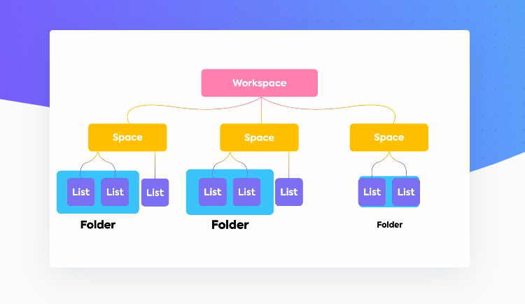
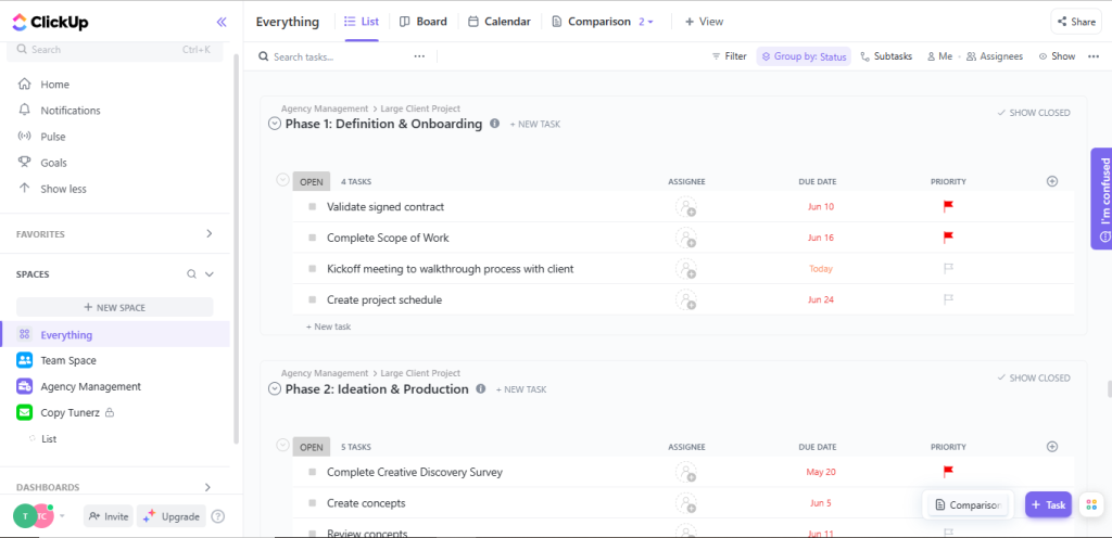
On ClickUp, you can create a workflow from scratch by manually assigning other team members to specific tasks, defining workflow, and setting due dates.
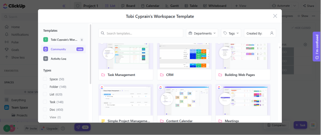
Or you can quickly get into the groove by selecting a pre-built, infinitely customizable ClickUp template.
There’s also the ClickApp module enabling managers to include or remove features from a workspace and customize their team’s experience.
The basic functionalities in the ClickApp index include screen recording, comment reaction, custom fields, dependency warnings, emails, milestones, pulse, etc.
monday.com on Workflow & Template
On Monday, each project has its own board with a color-coded view team leaders can use to get a distilled picture of assigned tasks, owners, timelines, and progress.
Unlike with ClickUp, monday.com rely on columns to organize workspaces.
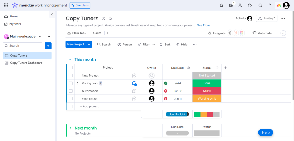
Setting up workflows using columns is straightforward and intuitive; there is no hierarchy complexity. Plus, the option to automate a task or integrate an app is always a click away.
And just like with ClickUp, project managers can enjoy a streamlined start on monday.com. Signing up grants you access to a series of five project planning templates.
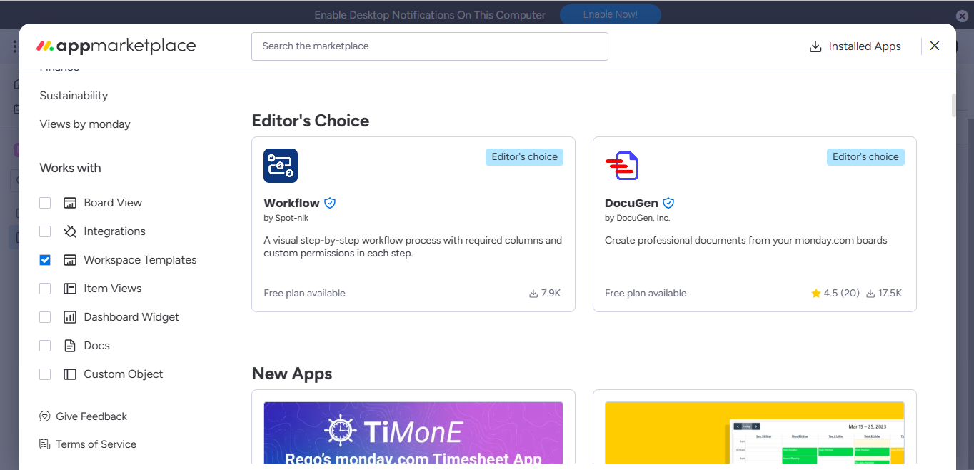
You can also go to Monday’s app marketplace to access free workspace templates across multiple categories.
Summary of ClickUp Vs. Monday on Workflow & Templates
Regarding templates, it’s hard to determine who comes out on top; ClickUp and Monday boast a vast gallery.
However, manually setting up a workflow from scratch on Monday comes with a more vibrant, colorful, and automated experience than with ClickUp.
Dashboard & Widgets
Project management tools with intuitive dashboards and easy-to-use widgets minimize background noise, allowing solo users and team members to focus on strategies that matter. Here’s how ClickUp and Monday compare.
ClickUp on Dashboard & Widgets
ClickUp dashboard offers a lot of white spaces, permitting managers to sculpt their dashboards from scratch. Click on the ‘Add card’ option at the right to add widgets across categories.
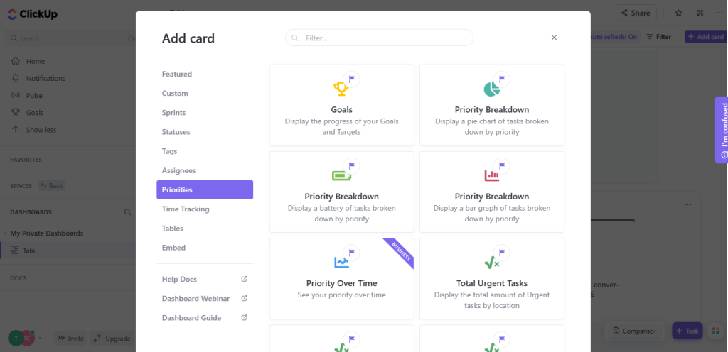
Once your dashboard is set up, you can filter for anything. Be it due dates, assignee, date done, dependency, time estimates, etc.
ClickUp’s dashboard, like Monday’s, comes with an auto-refresh option guaranteeing up-to-date data regardless of how many boards users connect.
monday.com on Dashboard & Widgets
Monday optimized its dashboard to help users hit the ground running by providing a feature-rich, easy-to-navigate interface.
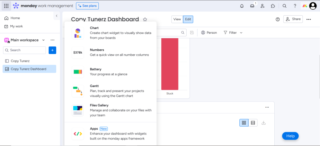
The vast array of widgets can help you stay on top of organization-wide needs like project deadlines and billing data or personal requirements like a to-do list or favorite playlist.
Plus, Monday’s filtering and sorting options provide infinitely customizable fields, just like ClickUp’s.
Summary: ClickUp Vs. Monday on Dashboard & Widgets
ClickUp’s dashboard is easy to navigate and offers more widgets (in the form of cards), but you need a business plan to access them. monday.com offers more robust widgets for free users.
Views
Sometimes, a unique perspective on how you or your team is performing might be all you need to visualize and plan your work differently. How many views are available on ClickUp and Monday?
ClickUp on Views
While ClickUp fancies the list view as its default option, users can switch between 15+ highly customizable views.
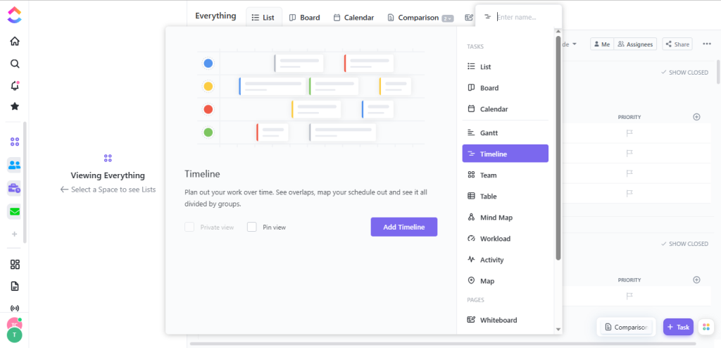
From mind map to calendar view, board, team, workload, Gantt, kanban, everything view, etc. ClickUp provides users with diverse options.
monday.com on Views
Monday offers fewer views than ClickUp. However, it provides just enough layouts to help project managers improve visibility across activities.
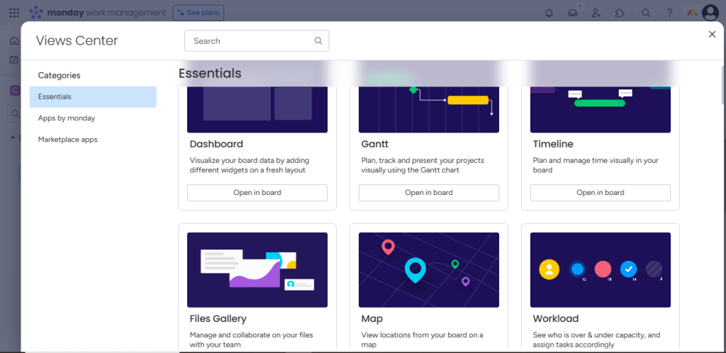
Some views available on Monday include Gantt, timeline, files, battery, map, workload, chart, kanban boards, List, etc.
Summary of ClickUp Vs. Monday on Views
ClickUp and Monday offer a handful of customizable views. If you’re a paying user, you’ll enjoy ClickUp’s views. Monday gives free users more versatile options.
Task-list Functionality
Assigning multiple projects to self or team members creates a bulky workspace that, if left unchecked, can become overwhelming. How does ClickUp and Monday’s task-list feature help simplify this hassle?
ClickUp’s Task-list Functionality
Creating a new task on ClickUp is straightforward—one of the few features that don’t require a learning curve.
Users simply need to click on the ‘new task’ option close to your title bar, and they are good to go.
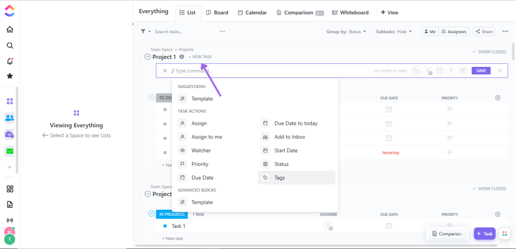
Within ClickUp’s ‘new task’ portal, managers can use the ‘/’ to choose between multiple commands such as setting due dates, editing tags, setting priority, watcher, start date, etc.
Monday’s Task-list Functionality
Monday’s task-list functionality is similar to ClickUp. It’s pretty easy to set up and allows users to optimize custom fields.
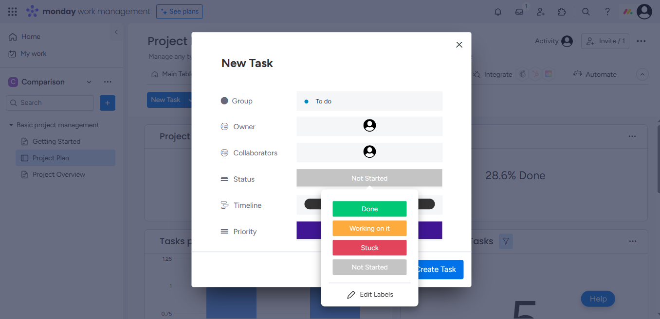
However, unlike ClickUp, Monday doesn’t restrict sub-tasks to the same properties as their parent tasks, permitting users to customize sub-tasks as independent items.
Summary of ClickUp Vs. Monday on Task-list Functionality
monday.com has an edge in task-list functionality with its unrestricted sub-task. However, newbies and power users can’t go wrong with either tool.
Brainstorming Capabilities
Mapping ideas analytically and using creativity to think outside the box is crucial to project success, begging the question; How well can ClickUp or Monday help users brainstorm and organize big ideas?
ClickUp on Brainstorming
ClickUp is the ultimate project management tool for brainstorming ideas. Its in-app mind map feature is perfect for streamlining random brainstorming sessions.
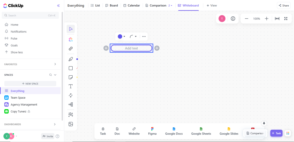
By inserting the mind map nodes on the interactive whiteboard, users can highlight and turn random ideas into assigned tasks with descriptions and deadlines.
OR, better still,instead of starting from scratch, managers can work with a whiteboard template.
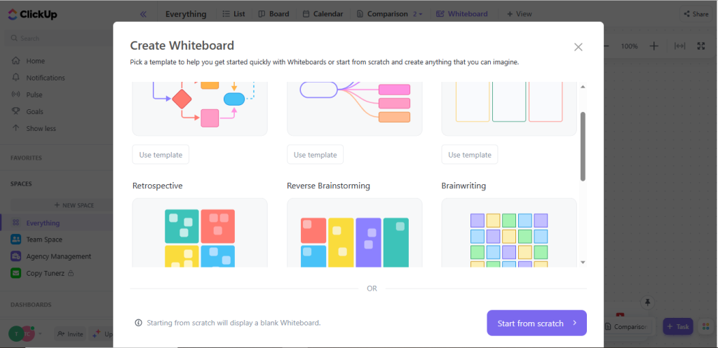
Team leaders can use ClickUp’s whiteboard templates to break down complex projects, create tasks, and set deadlines.
monday.com on Brainstorming
Unlike ClickUp, monday.com does not offer a dedicated mind map node for brainstorming.
However, users can easily install mind mapping on Monday with thoughtflow, which allows them to sketch ideas on its whiteboard and assign tasks in real-time.
Plus, there’s a dedicated brainstorming template in its free offering.
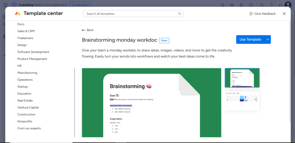
Enthusiastic users can use the word mind-map template to brainstorm ideas without worrying about structure or order.
Summary of ClickUp Vs. Monday on Brainstorming
ClickUp and Monday offer mind map nodes for brainstorming ideas and turning plans into tasks. However, mind mapping on ClickUp is more intuitive and user-friendly due to its in-app feature.
Tracking OKRs
A plan without primary objectives and key results (OKRs) would never know a finish line. Because without OKRs, there won’t be milestones and, ultimately, no goal to reach. Let’s see how well ClickUp and Monday can track OKR.
ClickUp on Tracking OKRs
ClickUp’s in-app goal-setting feature makes tracking objectives and key results (OKR) a breeze.
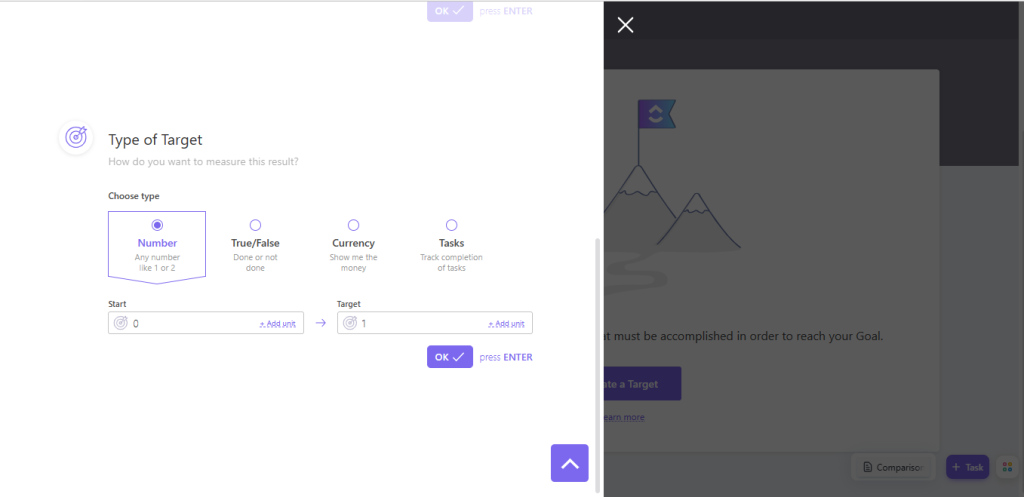
The PM hub allows users to break each goal into measurable targets trackable in real-time using numerical stats, true/false targets, and monetary insights.
monday.com on Tracking OKRs
Tracking OKR on Monday isn’t as natural as on ClickUp.
There is no dedicated goal-tracking feature. However, Monday’s vast template library offers a few goal-tracking variations users can customize to taste.
Summary of ClickUp Vs. Monday on Tracking OKRs
ClickUp’s goal-setting feature takes the lead, hands down. Monday’s OKR templates barely come close.
Automation
If you feel like you’re doing too much manual work—combing through too many boring and repetitive tasks—and would like to streamline your workflow, learning how ClickUp and Monday’s automation compare is necessary.
ClickUp on Automation
ClickUp offers a no-code automation sequence managers with non-technical backgrounds can use to eliminate errors and speed up workflow.
The sequence is simple.
Set a trigger (an event that activates the automation), then an optional condition (extra events that must be met), and an action (what should happen when all the conditions are met).
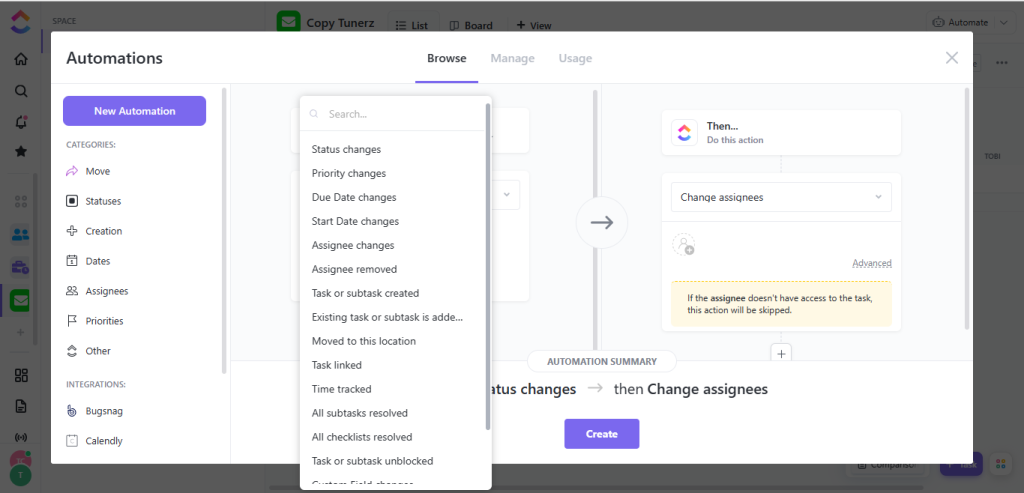
Keep in mind that ClickUp provides pre-built “Triggers and Actions” that you can combine to automate repetitive PM processes.
monday.com on Automation
monday.com follows the same automation sequence as ClickUp, ‘Trigger, condition, and action.’ However, its user interface is more intuitive and beginner-friendly than ClickUps.
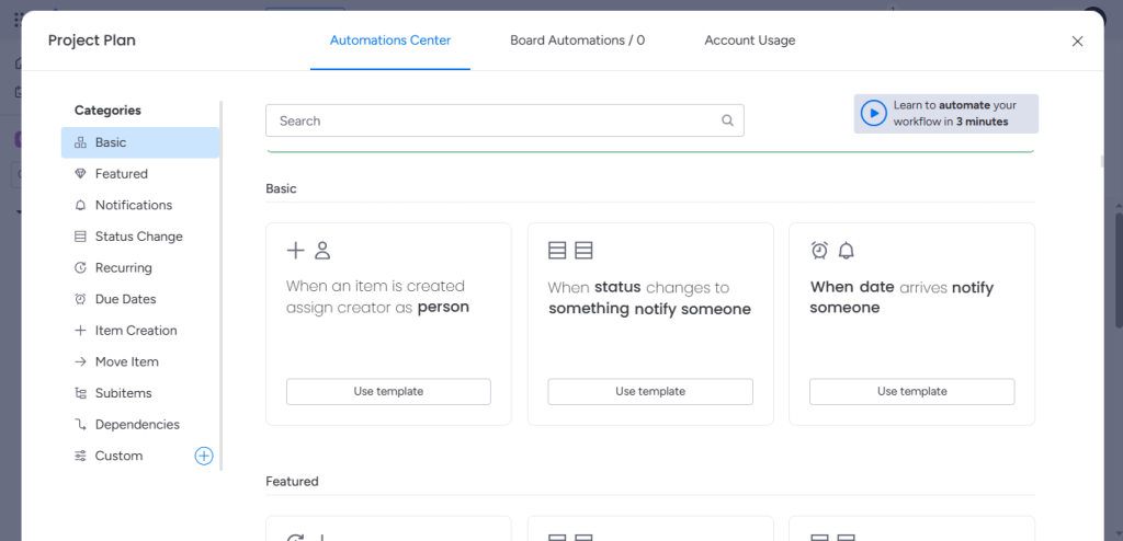
When managing projects on Monday, users can choose from tons of automated actions across different categories, move automation recipes between boards, and build custom automation around various elements.
Summary of ClickUp Vs. Monday on Automation
While Monday’s interface is more beginner friendly and easy to navigate, ClickUp is just as powerful for users that can spare an extra minute to get the hang of things. Overall, it’s a toss-up.
Reports
How well can ClickUp and Monday help users keep track of progression and productivity levels and manage resource allocation? Let’s find out.
ClickUp on Reports
ClickUp provides a convenient reporting feature for identifying roadblocks and improving team collaboration.
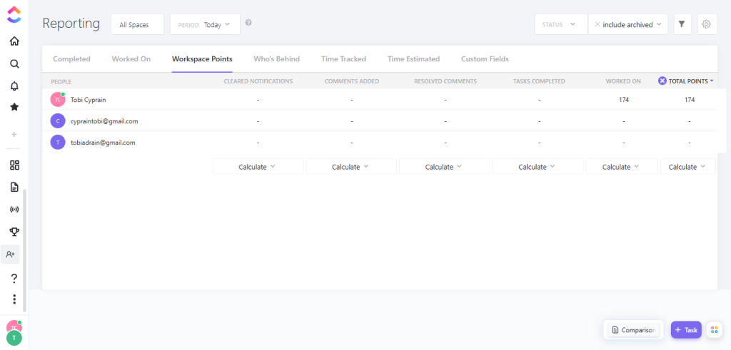
The PM hub gives users a comprehensive overview of everything happening in multiple workspaces.
Team leaders get precise data on tasks completed, time tracked, and who’s behind; team members get to weigh productivity level contests for workspace points.
monday.com on Reports
monday.com does not have a dedicated or sophisticated reporting page like ClickUp.
However, a project manager can track progress and get real-time analytics on scheduled tasks through Monday’s live dashboard.
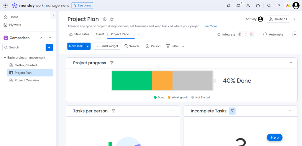
The live dashboard highlights important metrics like tasks completed, what’s in progress, and who’s yet to start. Users can also play around with widgets, filter options, and switch between views.
Summary of ClickUp Vs. Monday on Reports
If you’re looking for a detailed report of your team’s performance across departments, ClickUp’s robust reporting feature is preferred.
But if you just need something good enough to keep track of what’s happening within a workspace, Monday’s live dashboards will serve you well.
Time tracking
Behind every task are fleeing billable hours. Keeping track of these hours and monitoring how team members spend these hours goes a long way in determining overall productivity. Can ClickUp and Monday help users track time?
ClickUp on Time Tracking
Time tracking is ClickUp’s strong suit. It provides an easy-to-use in-app time-tracking feature team members can customize to suit specific project needs.
Users can manually input time or use the range option to set estimates.
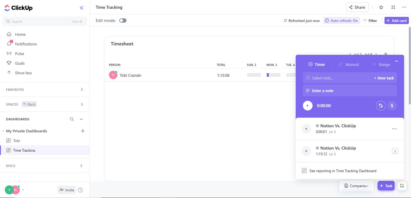
With its list of widgets and integrations, managers can calculate time based on the subtasks of a task, add time estimates, and create reports.
Freelancers and solopreneurs are not left out. They can use the in-app time tracker to segment billable and non-billable projects and see estimates.
monday.com on Time Tracking
Just like ClickUp, monday.com also brings everything time-tracking under one roof.
Whether you want to manually input billable hours or track time spent on tasks, the PM’s dashboard lets users view project status in real time.
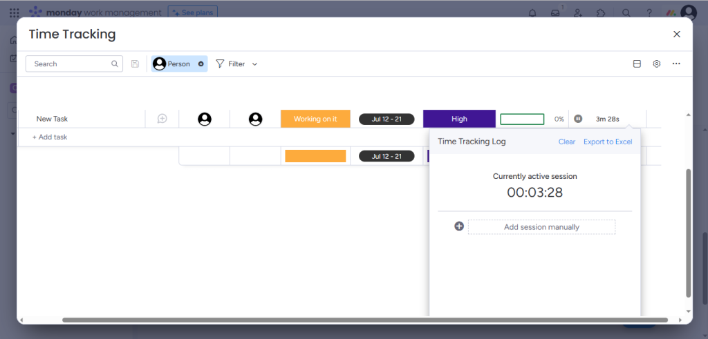
Paying users can use Monday’s time tracker to generate advanced reports showcasing easy-to-understand analytics of their projects.
There’s also an autopilot functionality that automatically updates the work status and halts time tracking once a project file is uploaded.
Summary of ClickUp Vs. Monday on Time Tracking
Time tracking on ClickUp and Monday is identical to a fault. You can’t go wrong with either tool.
CRM
Customer relationship management (CRM) is the central hub of client information. It’s where you keep track of deal flows and closing rates. Can ClickUp and Monday handle robust CRM needs?
ClickUp’s CRM
ClickUp does not offer an in-built CRM feature. But you can seamlessly integrate the app with a CRM from industry leaders like HubSpot.
Plus, if your project portfolio management needs are minimal, maybe you want to manage a small database, ClickUp offers a handful of well-designed templates you can use to streamline the process.
Monday’s CRM
While CRM is not a stand-alone feature on Monday’s PM work OS, a dedicated sales CRM app is among the bundle of interlinked products available.
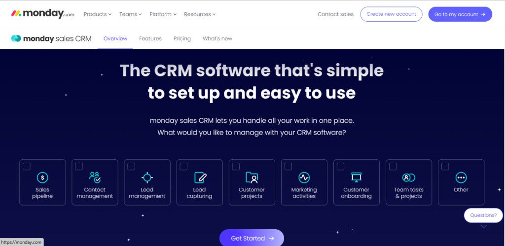
Managers can download the CRM app on the PM hub to edit deal stages, manage multiple pipelines, and automate sales processes.
Bear in mind that access to Monday’s sales CRM comes at an extra cost incurable outside the regular PM subscription.
Summary of ClickUp Vs. Monday on CRM
Monday’s CRM feature is a hair above ClickUp’s. The sales CRM is a more put-together implementation than ClickUp’s templates.
Privacy
Can ClickUp, and Monday help managers maintain discretion in an interconnected workspace without ruffling feathers? Let’s see.
ClickUp on Privacy
ClickUp allows free users and paying customers to customize privacy and maintain confidentiality across tasks.
To make a task private, simply limit access with the share button at the top right corner.
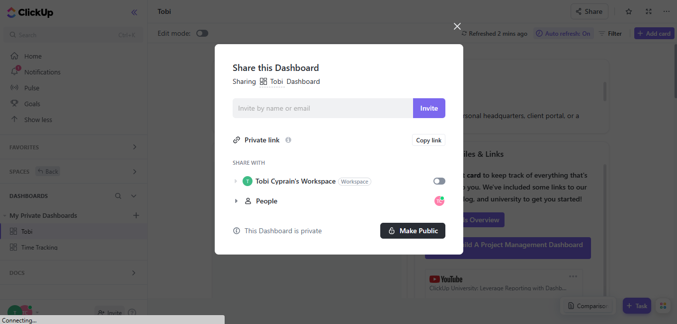
And for situations where you’re working with an outside contractor, you can create customized public links to share tasks.
monday.com on Privacy
There is no customizable option to generate private links on Monday’s free plan; however, free users can share files with outside contractors on a viewer-read-only basis.
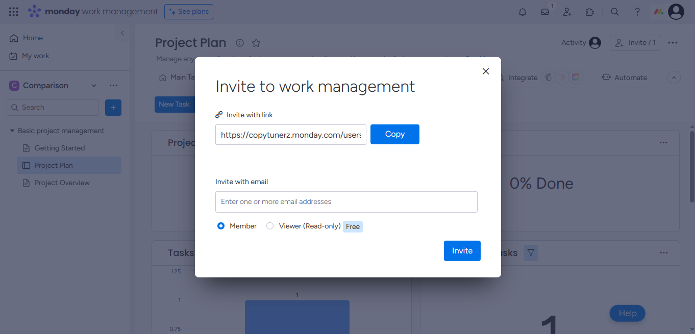
The work OS permits paying users to create private boards and invite multiple subscribers to edit or view tasks.
And, unlike with ClickUp, Monday leaves room for team members to create private boards that are unsearchable and invisible to company admins.
Summary of ClickUp Vs. Monday on Privacy
ClickUp and Monday offer robust privacy features that can help teams of all sizes maintain absolute discretion across projects. However, while paying users will enjoy Monday, free users will thrive on ClickUp.
Collaboration
Proper communication between managers, team members, and clients is the bedrock of a successful project. ClickUp and Monday thrive as collaborative tools but with different features.
ClickUp on Collaboration
Collaboration on ClickUp revolves around the barebone comments users can add to tasks, and a chat view, which supports real-time chat functions synonymous with Slack and Microsoft teams.
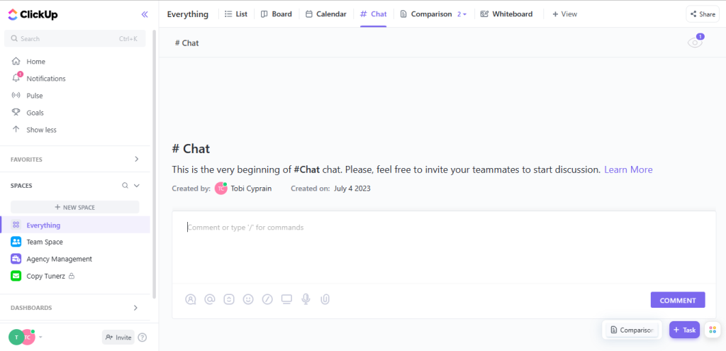
Free users can also use @ to tag themselves and team members in docs or use the proofing feature to mark changes on an artwork file.
ClickUp also offers:
- In-app screen recording features team members can use to show changes they’ve made,
- Whiteboards to streamline collaborative brainstorming activities,
- Live doc editing features,
- Integrates with emails, zoom, and hundreds of other collaboration tools,
- Compatible with smart speakers.
monday.com on Collaboration
Like ClickUp, Monday also offers a robust commenting feature team members can use to manage projects and stay updated on tasks.
Commenting on Monday happens within its columns. Team leaders can add descriptive updates with room for members to respond.
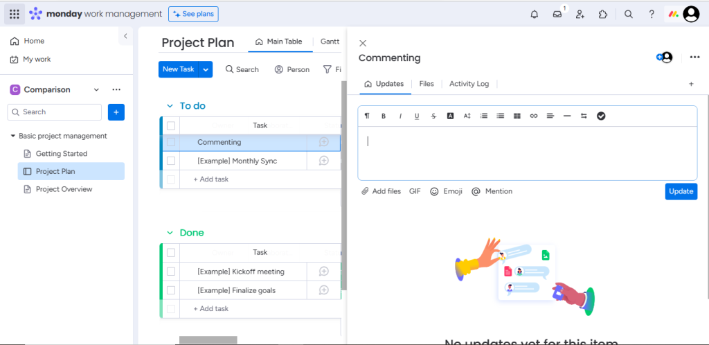
Monday’s commenting feature is robust. It supports interactive reactions through emojis and GIFs, then stores all activities in the inbox section, ensuring users never miss out on a notification.
Project managers can also use Monday to
- @ tag team members to work docs,
- Run collaborative sections on its whiteboard,
- Integrates natively with emails, Zoom, and hundreds of other collaboration tools.
Summary of ClickUp Vs. Monday on Collaboration
While Monday’s collaborative columns can help you keep tasks organized and ensure team members never miss a deadline, it does not offer a chat view like ClickUp. ClickUp is a better collaborative tool.
Pricing
For some project managers, pricing is an afterthought. For others, it’s the most crucial factor. It doesn’t matter where you stand; ClickUp and Monday offer budget-friendly pricing plans.
ClickUp’s Prices
ClickUp’s free plan enables smart notifications, milestones, custom exporting, sprint points, goals, email, proofing, and a host of other features.
However, its offerings are free for only two users and come with only 100 MB of storage space.
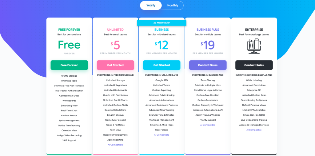
On a paid note, ClickUp offers four tiered plans. The unlimited plan starts at $5, the business plan at $12, business plus $19, and for enterprise solutions, users must contact support.
Monday’s Prices
Monday’s free plan is as basic as it gets. It supports only two members, three boards, 20 column types, and 1,000 items/tasks. The views are limited, and users can’t track time.
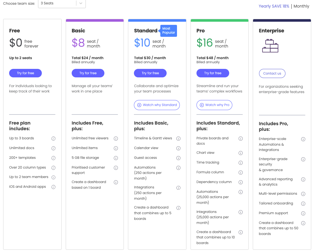
For paying users, monday.com also offers a four-tiered plan. Basic starts at $8, standard $10, pro $16, and for enterprise plans, users must contact support.
Summary of ClickUp Vs. Monday on Prices
Both project management platforms operate with a per-seat pricing model. Meaning the bigger your team, the higher you pay. However, ClickUp’s free offering is more robust.
Ease of Use, Learning & Support
PM tools lacking adequate learning materials or a frictionless support experience can bore users and eventually dampen productivity. How do ClickUp and Monday perform on this front?
ClickUp on Ease of Use, Learning & Support
ClickUp is available as a native desktop app for Windows, macOS, and Linux and as a mobile app for Apple’s watchOS, iOS, and Android devices.
But because of its robust features, its UI isn’t as user-friendly as Monday’s. However, it provides intuitive support materials to lessen the hassle of a steep learning curve.
Beginners can join ClickUp’s global community to deepen their knowledge, while non-tech-savvy managers can enroll with the university for a streamlined learning experience.
There is also a forum, a truckload of free how-to tutorials, demo videos, webinars, and ClickUp help for fast onboarding.
monday.com on Ease of Use, Learning & Support
Like ClickUp, Monday is available across all devices. The UX is less complex, the UI is more user-friendly, and the work OS color palette is bright and more pleasing to work on.
Monday’s learning curve isn’t as steep. Yet, they provide a whole heap of learning materials.
There’s a self-knowledge base for beginners to find and access a comprehensive index of resources and community to help non-tech savvy managers connect.
From webinars and how-to guides to live videos, live chat, support documentation, and help center, Monday ensures users are never left unaided.
Summary of ClickUp Vs. Monday on Ease of Use, Learning & Support
Monday’s UI is, to a commendable extent, more user-friendly and intuitive than ClickUp. However, if you need a robust PM tool and don’t mind a learning curve, ClickUp will do just fine.
Artificial intelligence (AI)
The AI revolution is here, and PM tools are massively adopting the trend. How are ClickUp and Monday holding up?
ClickUp on AI
Surprisingly, AI currently runs the gamut on ClickUp.
Their AI assistant—the first in the industry—offers hundreds of handcrafted, researched-backed AI prompts to eliminate guesswork from project management.
It’s the perfect tool for resource management. Tech-savvy and non-tech-savvy managers can use ClickUp’s AI assistant to:
- Spot behavior patterns among team members,
- Manage to-do lists,
- Generate and summarize text,
- Create tasks and subtasks, etc.
Note that the AI has a $5 subscription not included in ClickUp’s regular plans.
monday.com on AI
Monday also boasts of a sophisticated AI assistant, but it’s still in the beta launch phase.
It’s not yet available on their work OS framework.
Nonetheless, enthusiastic users can integrate Monday with ChatGPT or any AI tool to get more done faster.
Summary of ClickUp Vs. Monday on AI
ClickUp’s AI assistant is the best in the industry, not just compared to Monday, but overall. You’ll hardly find any PM tool with as much skin in the AI game as ClickUp.
Conclusion
Overall, ClickUp and Monday are loaded with everything Fortune 500 companies, modern teams, and entrepreneurs need to complete their work.
And indeed, they deserve every ounce of the love they get. So whichever you pick is anyone’s guess. To wrap things up on this project management software comparison piece, here’s our take on the ClickUp Vs. Monday debate:
- ClickUp is a more advanced PM tool with many features enterprise business owners and large teams will find helpful in streamlining complex workflows.
- On the other hand, Monday is a more simplistic, user-friendly work OS SMBs can use to automate mundane daily tasks and boost productivity.
Both are perfect for personal use. Good luck!
Share This Post
Della Yang
Della Yang is a marketing professional with a passion for the ever-changing digital landscape. She frequently writes tech news and reviews, sharing her knowledge and insights through blogs and various online platforms.
Allow cookies
This website uses cookies to enhance the user experience and for essential analytics purposes. By continuing to use the site, you agree to our use of cookies.


![Resume Worded: Is It the Best AI for Resume and LinkedIn Profile? [2025]](https://cdn.sanity.io/images/isy356iq/production/445abe2dda7018c73baf2d26f691e6e652976e4e-1200x800.jpg?h=200)