Landing Page vs Microsite: Everything You Should Know
Updated May 27, 2024
Published June 7, 2023

Landing pages and microsites are two important digital marketing assets that serve different purposes. A landing page is a single web page designed for a specific marketing campaign. It is where visitors arrive after clicking on an ad or link. A microsite is a small, separate website distinct from a company’s main website. It has its own URL and design.
This guide explores the key differences between landing pages and microsites and how they compare for various digital marketing goals. Clarifying the distinctions empowers marketers to leverage these vital tools effectively.
What is a Landing Page?
Often referred to as a “lead capture page” or a “lander”, a landing page serves a single, focused purpose – to convert visitors into leads. It’s the next step in the customer journey, following up on any promises made in your content. Essentially, landing pages bridge the gap between site visitors and converted customers.
Optimizing landing page design is crucial for engagement and conversion. Colors can influence user behavior; changing a call-to-action button color from green to read boosts conversions by 21% in studies. Readable typography ensures clear messaging. Relevant images forge emotional connections with audiences, also improving conversions.
Though landing pages have diverse uses, from capturing emails to promoting products, their ultimate goal is converting visitors to customers or leads.
What is a Microsite?
A microsite is a small website focused on a specific purpose or campaign. Unlike landing pages, microsites have multiple pages with unique content and navigation. Microsites are usually temporary, launched for a campaign or event before being retired.
Effective microsites feature targeted content, engaging designs, and clear calls-to-action. They incorporate brand identity elements but are detached from the main website, allowing creative freedom and experimentation. This makes microsites ideal for storytelling, product launches, and targeted marketing campaigns.
As separate entities, microsites provide opportunities to experiment with web design apart from the main website. With their own look and feel, microsites can enhance user engagement for their focused purpose.
Landing Page vs Microsite: Key Differences
Understanding the key differences between landing pages and microsites is vital for effective digital marketing strategies. We examine how these tools compare in terms of functionality, cost, conversion potential, and SEO impact.
Functionality
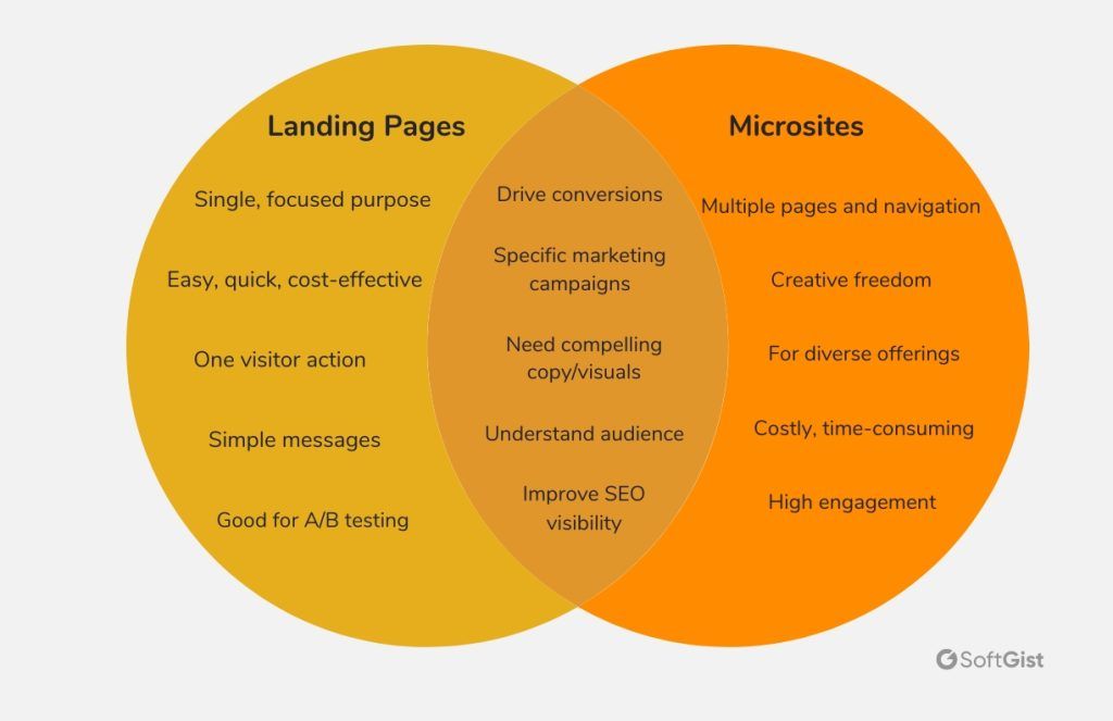
Microsites offer versatility with multiple pages and content types, but also added complexity in design and management. Landing pages are standalone pages focused on directing visitors towards a single action.
Cost
Landing pages are quick and easy to build, ideal for tight budgets or short timelines. Microsites require more resources for design and development, making them more costly and time-consuming.
Conversion Potential
Landing pages optimize every element to guide visitors towards conversions. Microsites provide engaging experiences but can dilute conversions due to the variety of content and elements on the site.
SEO Impact
Both landing pages and microsites can improve a website’s visibility in search engine results. Landing pages can attract targeted traffic through keyword optimization and backlinks. Microsites can target different keywords and audiences, potentially increasing your brand’s reach. However, they require more SEO work.

Pros and Cons of Landing Pages
Pros
- Cost-effective and easy to create
- Drive specific actions
- Allow targeted messaging
- Often improve conversion rates
- Excellent for A/B testing different versions
Cons
- Not ideal for complex messages
- Cannot showcase multiple offerings
- Lack depth of user engagement
- Typically one page with straightforward interactions
Landing pages provide an affordable way to create focused pages that convert visitors. However, their singular call-to-action limits engagement and suitability for multifaceted content. Understanding these tradeoffs allows leveraging landing pages effectively for their strengths in conversion optimization.
Pros and Cons of Microsites
Pros
- Allow in-depth and engaging experiences
- Enable creative storytelling
- Can be tailored to specific audiences and campaigns
- Offer flexibility to experiment with designs and content
- Provide an immersive, engaging user experience
Cons
- More costly to create and maintain
- Require extensive design and development work
- Multipurpose nature can dilute conversion potential
Microsites provide versatile, multipage websites with engaging experiences. However, they demand more resources to build and manage while leaving conversion potential more diffuse. Evaluating these tradeoffs allows strategically leveraging microsites for storytelling and showcasing multifaceted content. Their flexibility empowers impactful campaigns tailored to specific audiences.
Real-world Examples
To get a clearer perspective on the “Landing Page vs Microsite” debate, let’s delve into some successful real-world examples of both.
Airbnb Host Landing Page

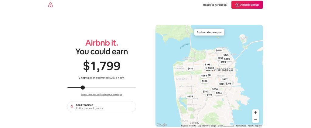
Airbnb’s landing page for recruiting hosts is a great example of an effective landing page. The page has a clear singular goal – get visitors to become Airbnb hosts. It focuses only on information relevant to that goal.
The page explains the process of becoming a host step-by-step. It highlights the benefits of hosting and support offered by Airbnb. An appealing call-to-action (“Airbnb it and earn”) and earnings estimate tool provide motivation to sign up.
The page is concise. It includes only essential information to get visitors to that final step of signing up as a host. It is designed strategically, with every element guiding visitors to convert. This makes Airbnb’s host landing page an excellent model for conversion-driven landing page design.
Google Santa Tracker

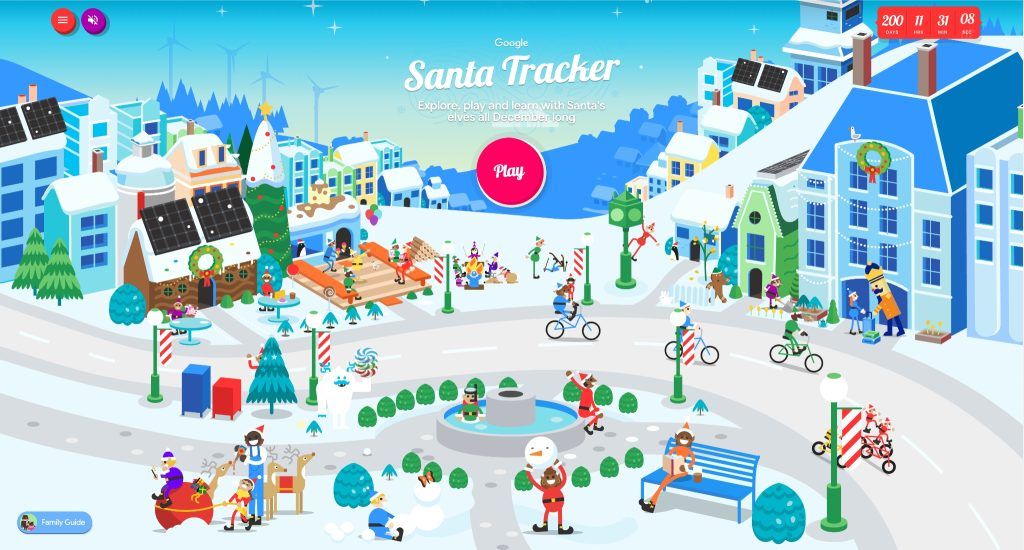
Google’s Santa Tracker microsite is a fun, engaging website that tracks Santa’s journey on Christmas Eve. This multi-page site has various activities and games for visitors.
As a separate microsite, it has a unique festive design and navigation compared to Google’s main website. This allows creative freedom to build an immersive Santa-tracking experience.
The microsite offers an engaging user experience across multiple pages. This exceeds what a single landing page could provide. With its festive theme and variety of interactions, Google’s Santa Tracker is a successful example of an engaging, multi-page microsite experience.
Practical Tips for Creating Effective Landing Pages and Microsites
The formula for creating high-performing landing pages and microsites combines an attractive design, convincing content, and a thorough understanding of your audience’s needs. Here’s the approach:
- Compelling Copy: Use clear, concise, and persuasive copy. Emphasize benefits and provide incentives to motivate visitors to act. Focus on delivering value to your audience, rather than simply listing features.
- Relevant Visuals: Select images that are pertinent to your offer and are in harmony with your brand. Videos or infographics are effective tools to break down complex information into easily digestible chunks.
- A/B Testing: Another best practice is to conduct A/B testing, which involves comparing two versions of a page to optimize performance and boost conversion rates. Test one change at a time to pinpoint improvements.
- SEO Optimization: It’s vital to make your landing pages and microsites search engine friendly. Incorporate relevant keywords in content, meta tags, URLs. Ensure fast load times and mobile compatibility.
- Understand your Audience: Know your audience inside and out. Leverage analytics tools, surveys, interviews to gain insights into their demographics, interests, behaviors, pain points and motivations. Use these insights to shape content that speaks directly to their preferences and needs. Craft messaging and visuals that resonate with their needs and inspire action.
- Keep it simple: Remember, simplicity is key; avoid overwhelming visitors with excessive information or options. Keep the design clean and navigation straightforward. Make it easy for visitors to understand your offer and what action to take.
- Monitor and adjust: Digital marketing is dynamic so consistently monitor metrics and be ready to adjust strategies as needed. Stay open to testing new ideas and learning from mistakes. Keep optimizing based on what works for your audience.
The key to successful landing pages and microsites is an audience-focused approach. Keep your audience’s needs and preferences central when designing. Tailor content and experiences to resonate with their motivations.
With the right approach and continuous optimization, your landing pages and microsites can become powerful digital marketing tools.
Deciding What’s Best for Your Business
The “Landing Page vs Microsite” decision isn’t one-size-fits-all. It depends on factors such as your marketing goals, budget, SEO objectives, and the complexity of the message you aim to convey.
- Marketing Goals: For specific objectives, like gathering email subscriptions, a landing page could be your best bet. But for a more immersive experience or a wider product range showcase, consider a microsite.
- Budget: In terms of cost and creation time, landing pages typically have the upper hand over microsites, making them a viable option for businesses on a budget or with tight schedules. However, if resources and time permit, a microsite can offer a more engaging and memorable user experience.
- Complexity of Message: Landing pages are best suited to simple, straightforward messages. However, if you’re intending to convey a complex message or showcase a diverse range of products or services, a microsite might be the better fit.
- SEO Goals: When targeting a specific keyword or audience, a landing page could be a powerful tool. Yet, for a broader set of keywords or audiences, a microsite might be the go-to option.
Conclusion
When it comes to landing pages vs. microsites, it’s not about pitting one against the other. They each fulfill different digital marketing needs.
The choice comes down to your specific goals, budget, and message. Landing pages are your focused powerhouse for driving conversions. Microsites are your creative canvas for in-depth storytelling.
Success lies in truly understanding your audience. Get to know their pain points, motivations and preferences. Craft valuable experiences tailored to them.
At the end of the day, choose the tool aligned with your audience and goals. With strategic intent, both landing pages and microsites will propel your digital marketing forward.
Share This Post
Della Yang
Della Yang is a marketing professional with a passion for the ever-changing digital landscape. She frequently writes tech news and reviews, sharing her knowledge and insights through blogs and various online platforms.
Allow cookies
This website uses cookies to enhance the user experience and for essential analytics purposes. By continuing to use the site, you agree to our use of cookies.
